Layout Shape
This is a deprecated feature. See Layouts for the replacement feature.
Intro
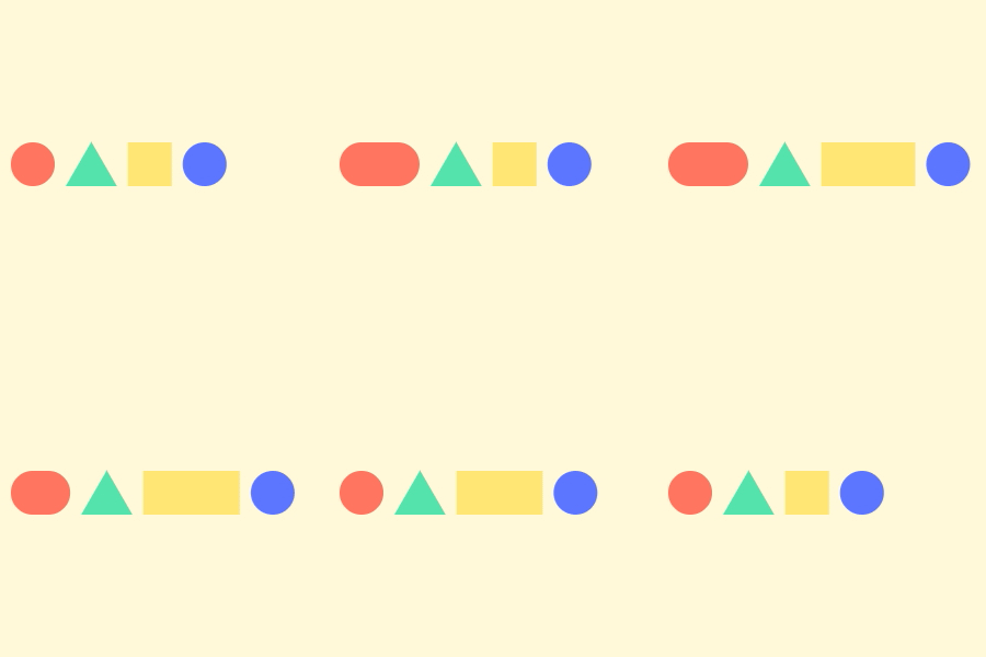
When you add Shapes to a Layout Shape, the Shapes are stacked next to each other (either vertically, horizontally or in a grid). The Layout Shape's size is then determined by the total size of the Shapes within it. The result is that as you animate a Shape contained in a Layout Shape the others will move in relation to it.

UI
Layout - Select how Shapes are laid out:
- Grid Layout - see Grid Layout.
- Horizontal Layout - see Horizontal Layout.
- Vertical Layout - see Vertical Layout.
Size - set the dimensions of the Layout Shape. By default, this is connected to Composition's Resolution attribute. To manually set this value, delete this connection.
Add Spacer - spacers can be used to create gaps or blank cells in the Layout.
Layout Items - drag 'n' drop or connect Shapes to this area.There are further options within the Layout Items list. These differ depending on the Layout mode selected:
- toggle whether a Shape appears in the Layout or not.
Settings:
- Grid Layout
- Column Span - set how many columns a Shape will span. A setting of 2 will mean a Shape will be placed in a cell 2 columns wide.
- Row Span - set how many rows a Shape will span. A setting of 2 will mean a Shape will be placed in a cell 2 rows tall.
- Fixed Position - set a fixed cell for a Shape to be positioned in.
- Position - set a cell for the Shape to be positioned in. For example, values of 2, 2 will position the Shape in the second column of the second row.
- Horizontal Layout
- Baseline - place Shapes on the baseline. This is useful for aligning Text and Shapes.
- Vertical Alignment - set the vertical alignment for the Shape within its cell.
- Vertical Layout
- Horizontal Alignment - set the horizontal alignment for the Shape within its cell.
- Grid Layout
- remove the Shape from the Layout Items.