Contrasting Color
Intro
Output colors that contrast with an input color.
A common task in UI design is picking colors for text or icons that contrast sufficiently with a background color to be clearly readable/legible. The Contrasting Color Utility can be used to automate this process and ensure compliance with the latest WCAG accessibility standards.
UI
Mode - Set a contrast ratio to test the Input Color against the Primary Color:
- Most Contrasting - Output the color (Primary or Secondary) that is the most constrasting with the Input Color.
- Least Contrasting - Output the color (Primary or Secondary) that is the least constrasting with the Input Color.
- 3:1 - The bare minimum level to adhere to. Also known as A Level (essential compliance).
- 4.5:1 - Both usable and accessible for most users. Also known as AA Level (acceptable compliance).
- 7:1 - The gold standard level of accessibility. Also known as AAA Level (optimal compliance).
- Custom - Set a custom Custom Ratio.
Custom Ratio - Set a custom ratio of [value]:1.
Input Color - Set the color to test against the Primary Color. Typically, this is the color of the text or icon.
Primary Color - Set a color to test against the Input Color. If the contrast ratio test is passed, this color is output.
Secondary Color - Set an alternative color to be output if the Primary Color fails the contrast ratio test.
- Create a Rectangle.
- Create an Ellipse:
- Set Radius to 70.
- Disable Fill.
- Enable Stroke.
- Group the Rectangle and the Ellipse.
- With the Group selected, click the Duplicator icon in the Shelf.
- Set the Duplicator's Grid Size (Width and Height) to 500.
- Create a Color Array.
- Using the
 button, add 3 more indices and set a different color for each. Ensure the colors are a mix of light and dark colors.
 - Connect colorArray.id→rectangle.fill.color.
- Create a Contrasting Color Utility.
- Connect colorArray.id→contrastingColor.inputColor.
- Connect contrastingColor.id→ellipse.stroke.color.
The Stroke color for the ellipses that are sitting on the rectangles with the lighter colours should be set to the Primary Color and vice versa.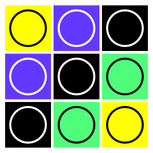
It's best practice to pick Primary and Secondary colors that contrast with each other to ensure that when one fails, the other is more likely to have sufficient contrast to be clearly legible.